We are the crypto industry. We think a technology with such great potential deserves our collective attention and imagination. This is our brand essence and is reflected in everything we do. Our brand identity is composed of the logo, color palette, typography, and unique elements that work together and create one unified whole. Together, we advance policy that ensures the success of crypto networks.
With agency.
With consensus.
With vision.
This is an abbreviated version of our brand guidelines.
Scroll down to view the full version in a pdf.
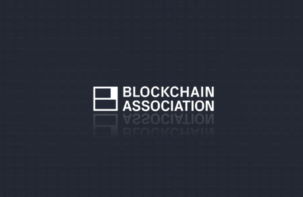
Logos
The Blockchain Association logo acts as the hero element in our brand recognition. It is composed of the symbol and the wordmark working cohesively together. Although the symbol can stand on its own, the most widely used lockup should be the horizontal format followed by the vertical setting. As an emerging brand it is paramount that the logo is used consistently and correctly across all work.
Logo Variations

HORIZONTAL LOCKUP
Charcoal

HORIZONTAL LOCKUP
White

VERTICAL LOCKUP
White

VERTICAL LOCKUP
Charcoal
LOGOS
Typography
Our typography reflects our brand essence: real potential. By being consistent with our font usage, we believe it establishes our commitment to being intuitive, humanistic, honest, technical and awe-inspiring.
fonts
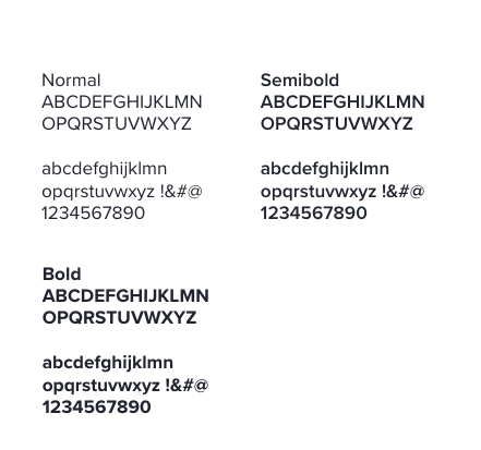
- IBM Plex Sans is our familiar and intuitive typeface.
For use on call outs, titles, key numbers and subheads.
Only Semibold, Medium, and Regular weights should be used.
Link to font ► - Proxima Nova is our elevated and optimistic typeface.
For use on headlines, body copy and data.
Only Normal, Semibold and Bold weights should be used.
Link to font ►
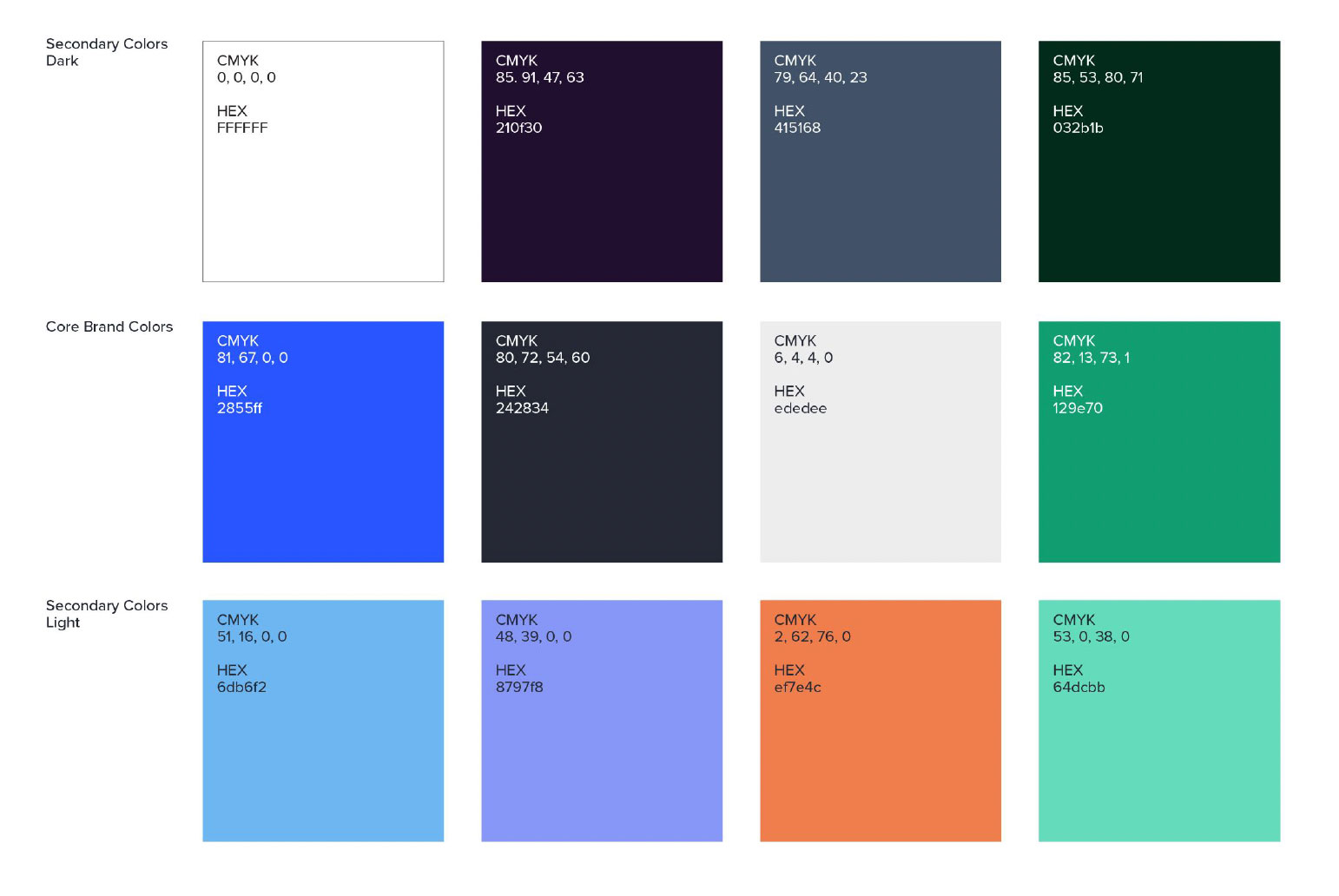
COLORS
Colors
Like everything that runs through Blockchain Association, the color palette is designed to reflect optimism, technology and carry a bold impact.
The most used primary brand colors (cobalt and charcoal) carry an elevated authoritative tone, while the neutrals (space grey and white) help balance the colors in an intuitive and familiar way.